Excerpt: Blue Scoop Haus is a residence designed by the architectural firm DIG Architects. The spine of the design is the exuberant use of colours, which is a critical element of the Indian culture. The subtle yet definitive use of colours to connect with the space without being overwhelming and out of sync presented a new challenge. The intent of this design was to work within the context of the Indian cultural narrative with a new language of interpretation that allows for a dynamic, varied and yet enduring experience for the end-user.
Project Description
[Text as submitted by Architect] The intent of this design was to work within the context of the Indian cultural narrative with a new language of interpretation that allows for a dynamic, varied and yet enduring experience for the end-user.
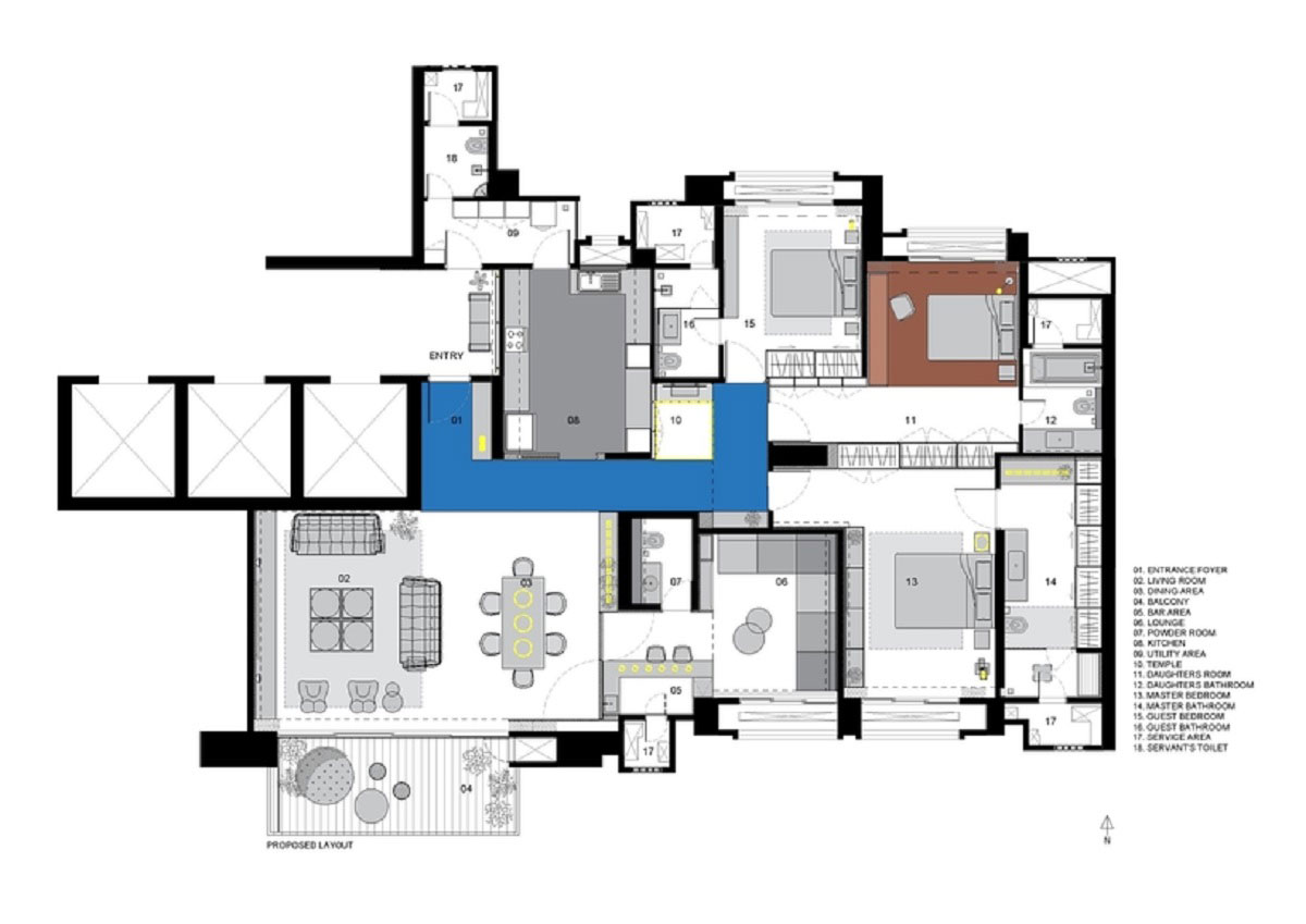
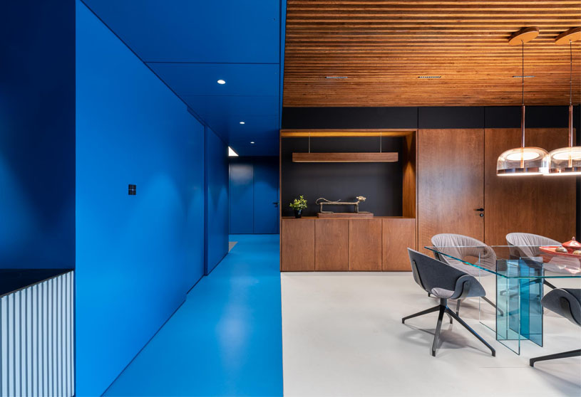
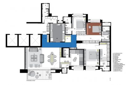
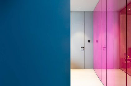
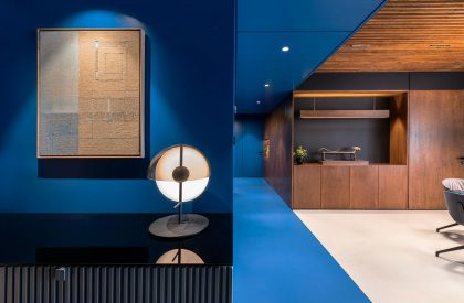
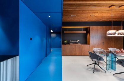
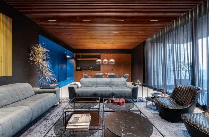
The spine of the design is the exuberant use of colours, which is a critical element of the Indian culture. The subtle yet definitive use of colours to connect with the space without being overwhelming and out of sync presented a new challenge. The mainstay of the theory is the large volume that starts right from the entrance spanning to the lobby for individual rooms. This volume has been termed ‘The Blue Scoop’.
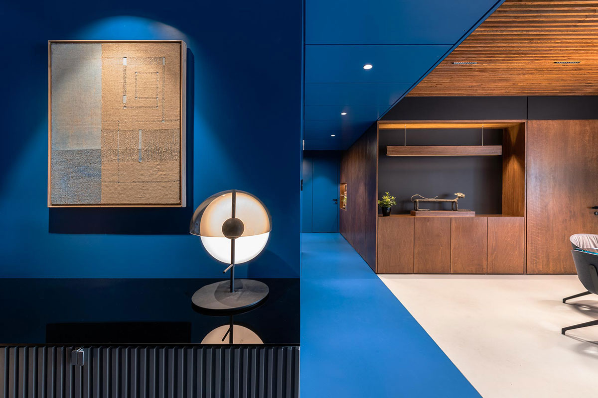
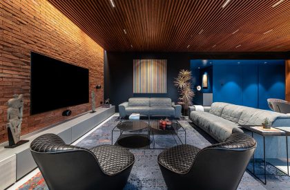
The design intent for it was achieved by having all the surfaces connected to this volume in a single tone of the colour (Blue). This move creates an illusion of a chunk of mass being subtracted (scooped) and separated from the overall volume. Keeping the spaces muted around this scoop further ensures that there is an emphasis on this space being the mainstay of design.
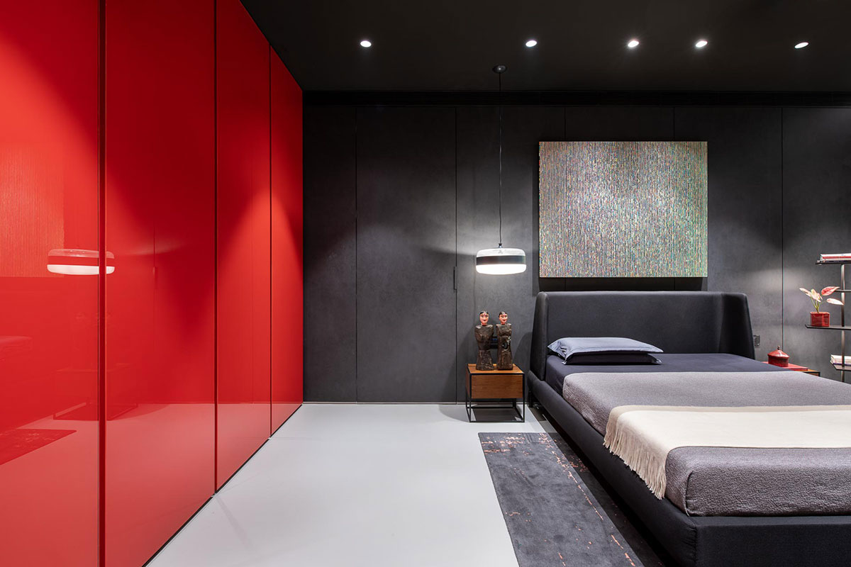
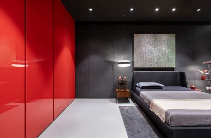
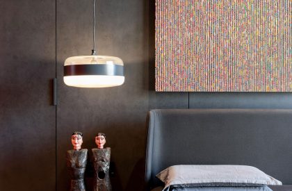
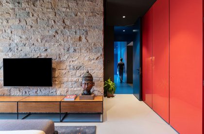
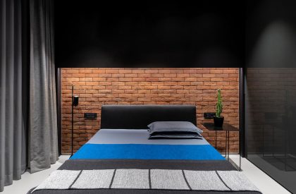
Another example of the inspired use of colour is how the colour black is used in this space. Black, typically considered taboo, can offer a new interpretation of other colours and elements around it if used wisely. In this project, the colour black provides contrast and context to the different colours.
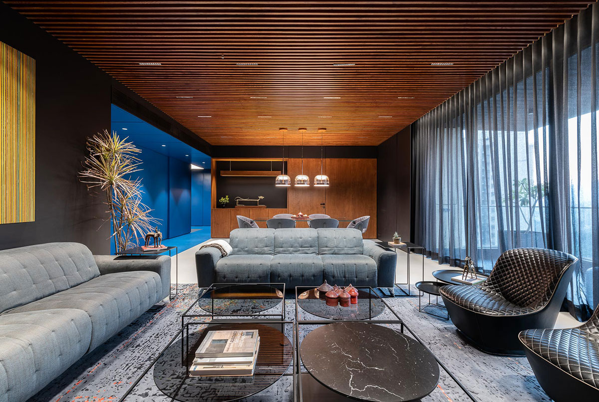
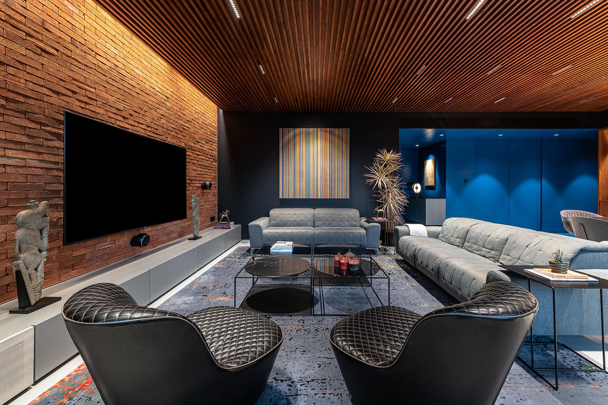
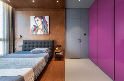
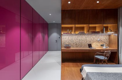
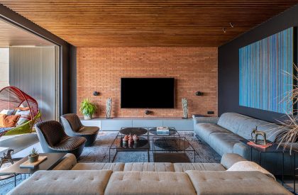
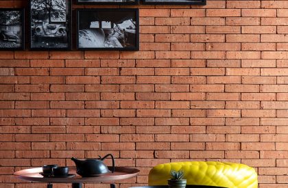
We have attempted to continue the Indian cultural narrative using local raw materials. The textures of these individual essential elements, such as brick and stone, were highlighted using available natural light. The material palette consists of Godhra brick tiles, concrete floor and stained Birch plywood in its raw form. At the same time, elements like coloured PU back painted glass and matte black paint balance out the rusticity.
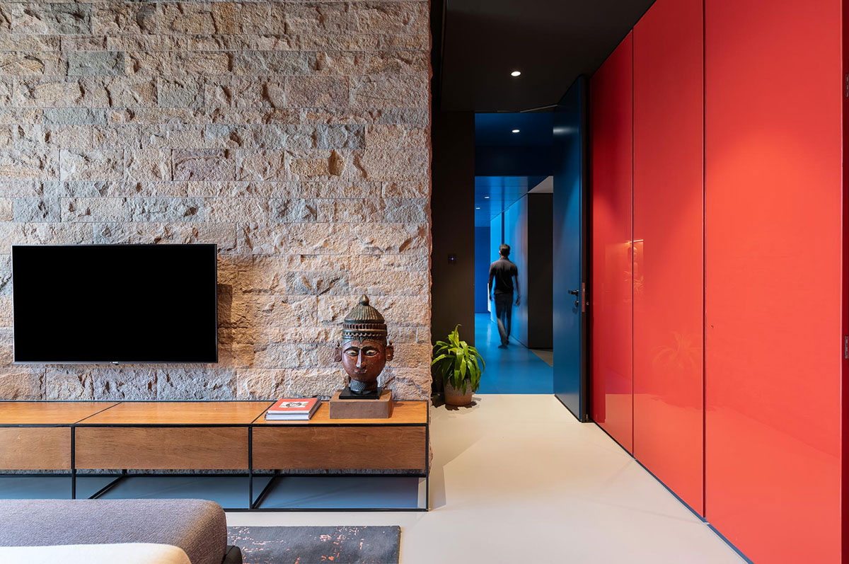
The correlation between the living space and the lounge area is conceptualized to achieve much-needed modularity. One can create different scenarios by opening and shutting door panels. Careful consideration has been given to where the doors are parked during these scenarios.
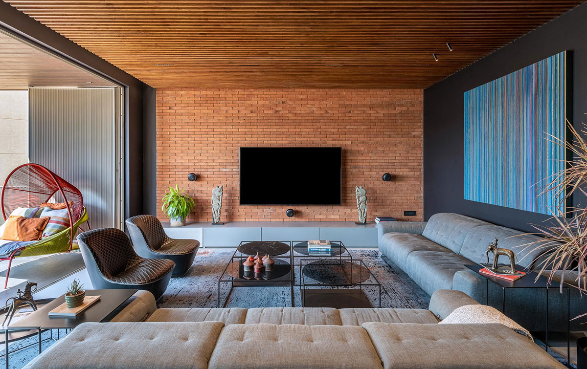
While weaving an Indian cultural narrative through these different elements, we tried to create a new ‘language interpretation’ that doesn’t rigidly adhere to dichotomies like Indian v/s western, modern v/s traditional. Such narratives can be found via the artwork of old vintage cars and global 3D artwork coexisting with Bastar’s tribal art in the same space. The intent has been to provide an ‘experience’ to the end-user that is unpredictable and dynamic. Creating such an experience indeed involves risk-taking for the designers. Still, the reward is an unprecedented yet enduring experience for the clients.
