Excerpt: The Orange Extension is an architectural project designed by SHROFFLEoN in India. Their intervention in addition to incorporating materials to signify a seamless transition into the old, utilized the rustic yet poetic materiality of weathering steel –a material that eliminates the need for painting, and forms a stable rust like appearance once exposed to the weather. Hence the name, THE ORANGE EXTENSION.
Project Description
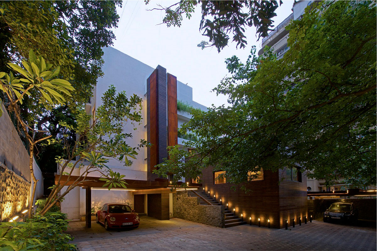
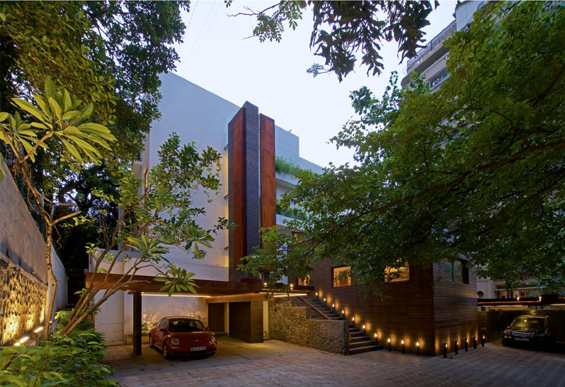
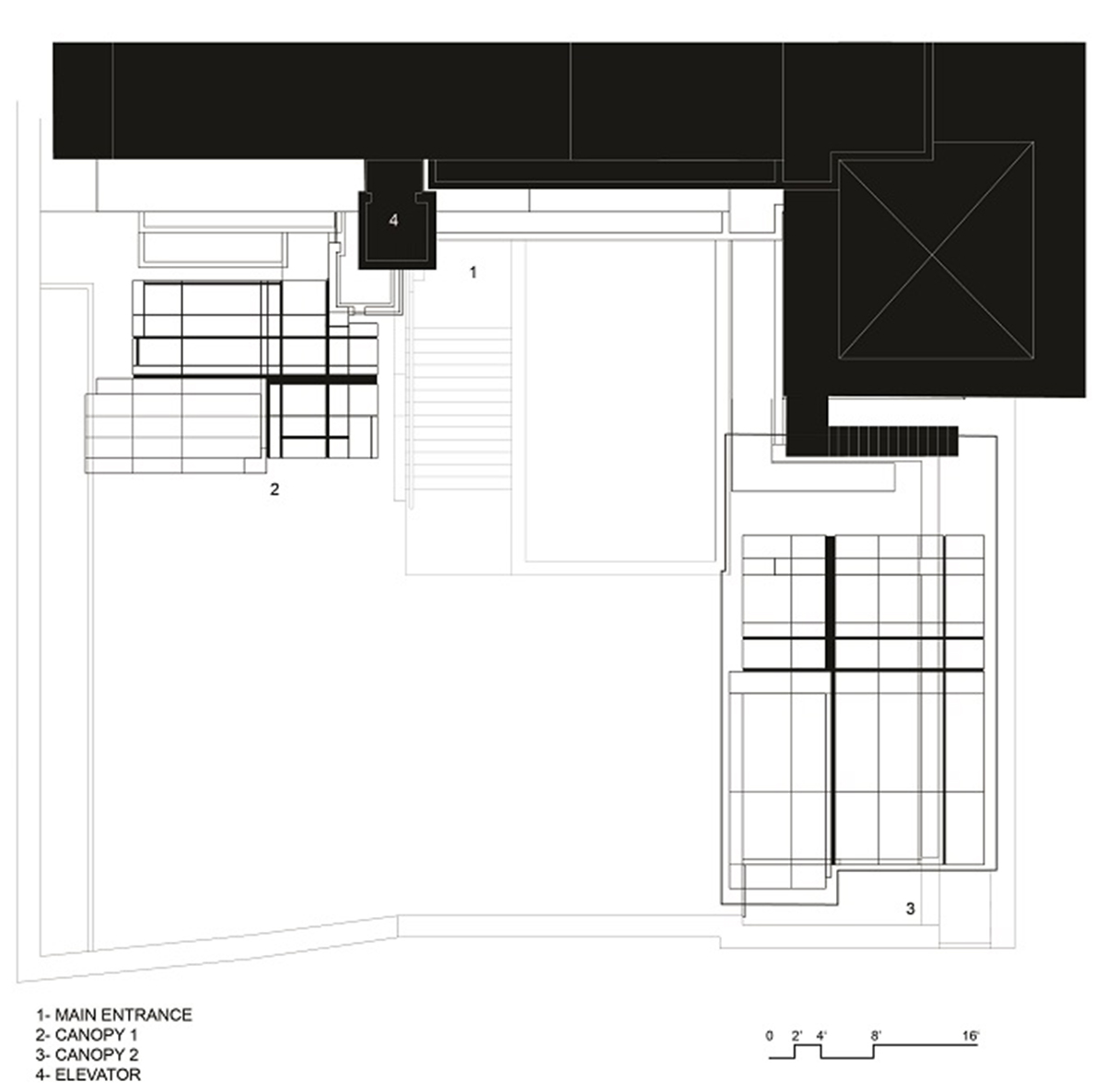
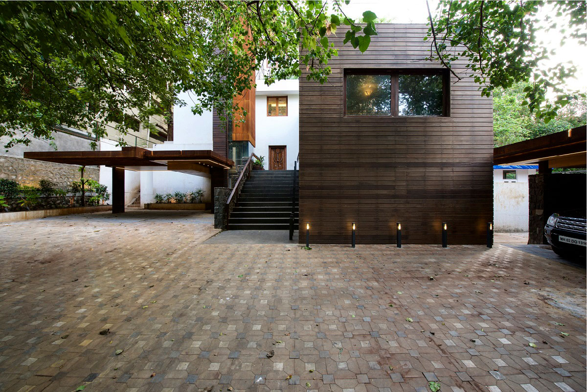
[Text as submitted by architect] The project is an extension to a large 60 year old family home in Bandra, Mumbai, 1500 square meters, spread over four floors. The client being a lover and collector of super luxury cars requested twin extensions to his home in the form of canopies, to protect his prized possessions from the elements, along with an overall modernization of the facilities including an exterior elevator core.
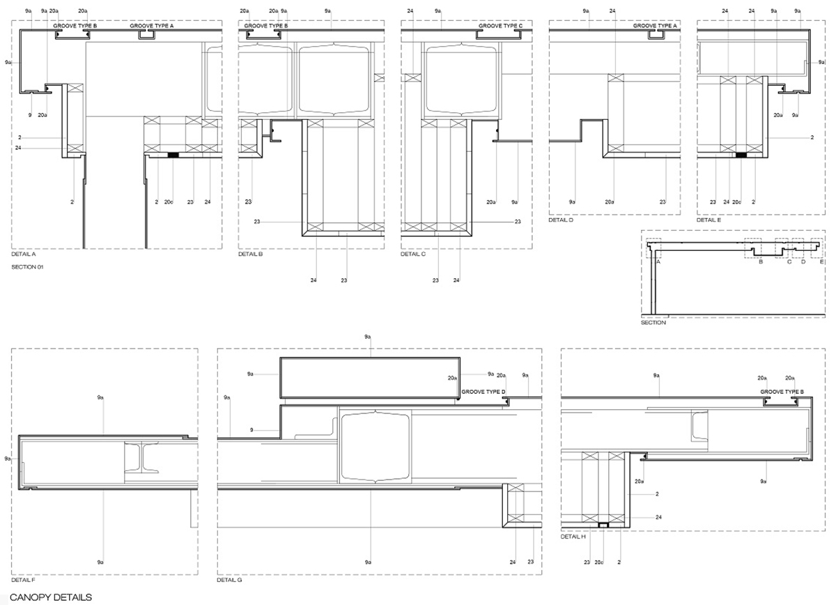
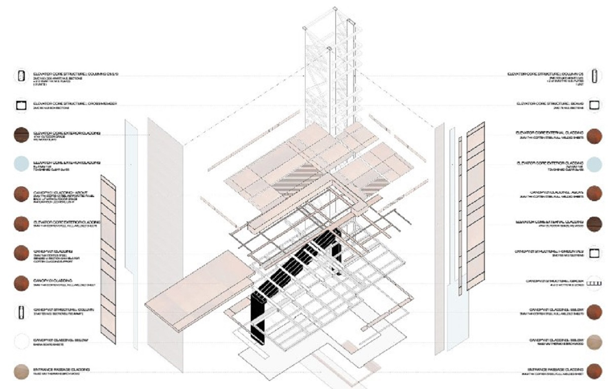
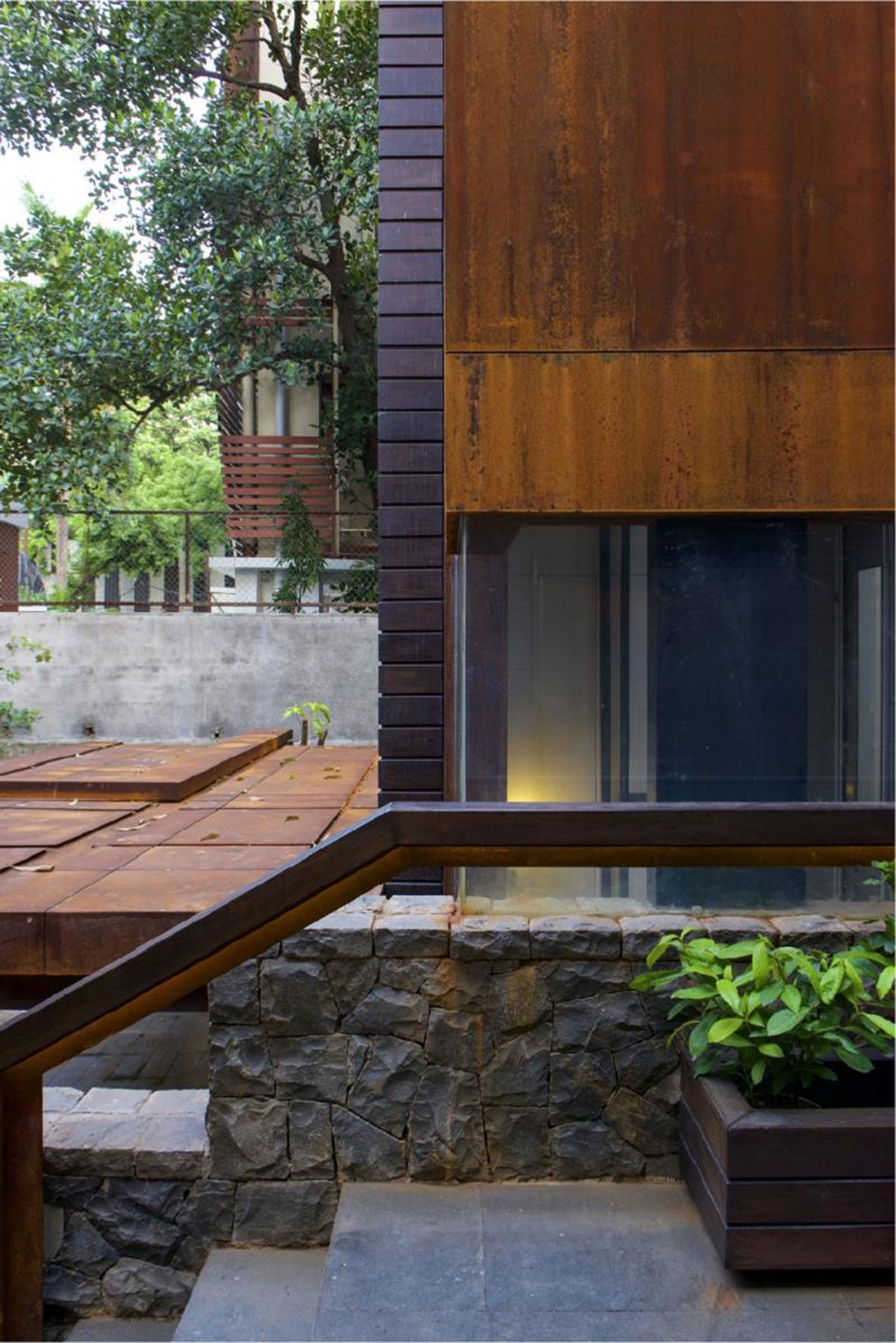
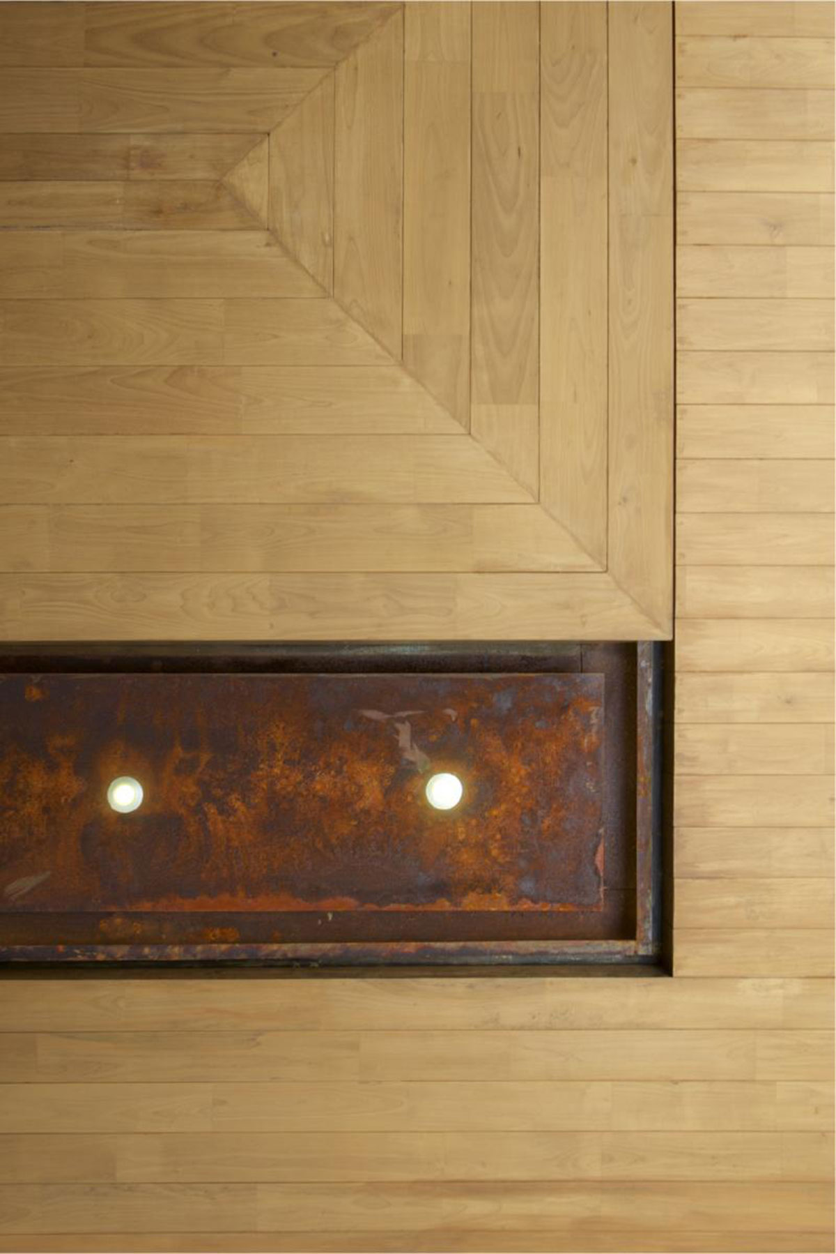
Of utmost importance to the client was the treatment of our interventions as sculpted objects in the round – with each surface demanding a meticulous attention to detail – especially as every face, including the under belly, is visually accessible to visitors whilst entering the home. Our proposal utilized the existing geometry on site as indicators, and used them to generate a geometry, resulting in a form that fits snugly within the existing context. These site guidelines, indicators,are expressed in the form of grooves, of varying widths, that stress the importance of certain contextual placements over others.
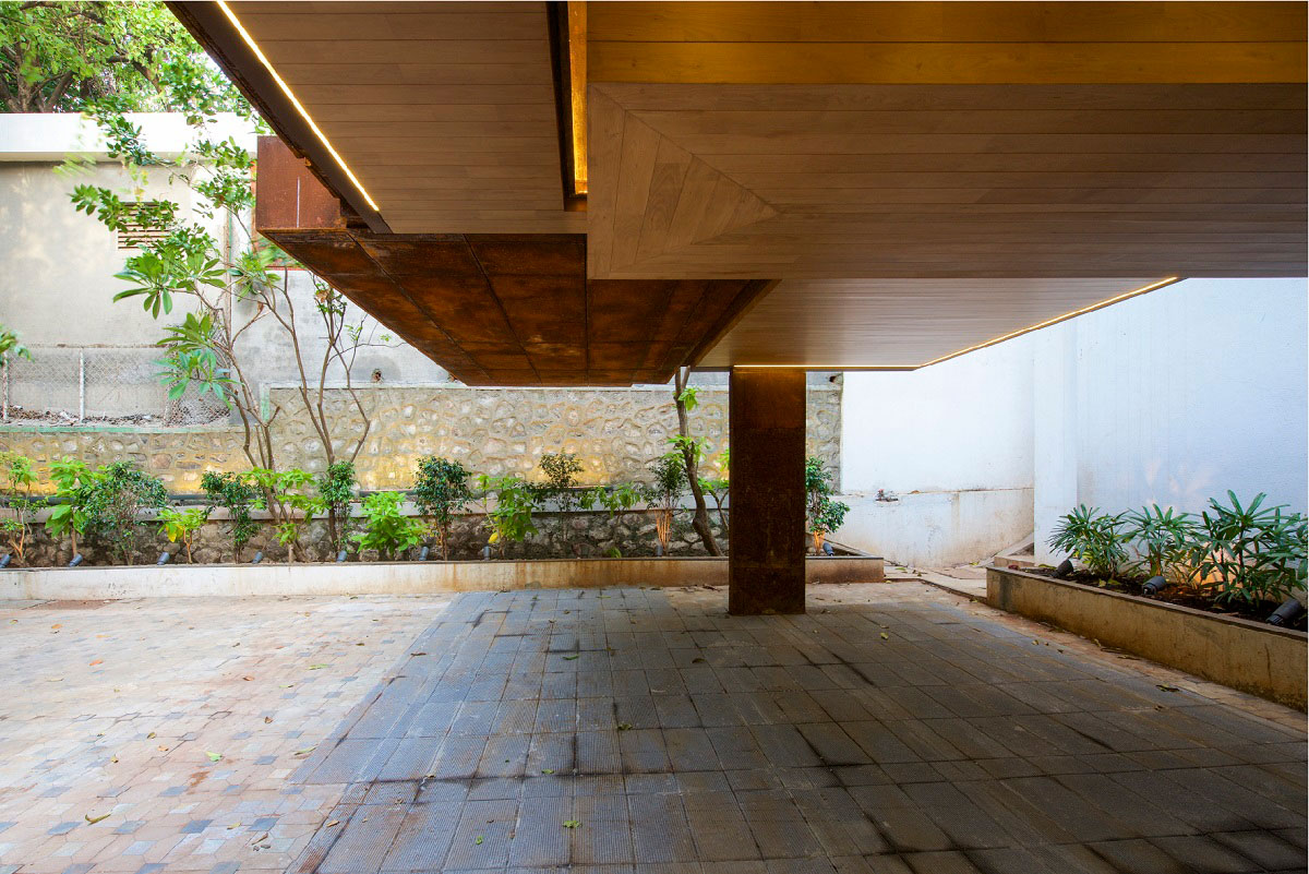
The major grooves have embedded within them lights, highlighting the importance of the primary contextual connections. This resulting network of grooves serves the double purpose of channelling rainwater into a collection plate, from where it is discharged ceremoniously into the adjoining flower bed.
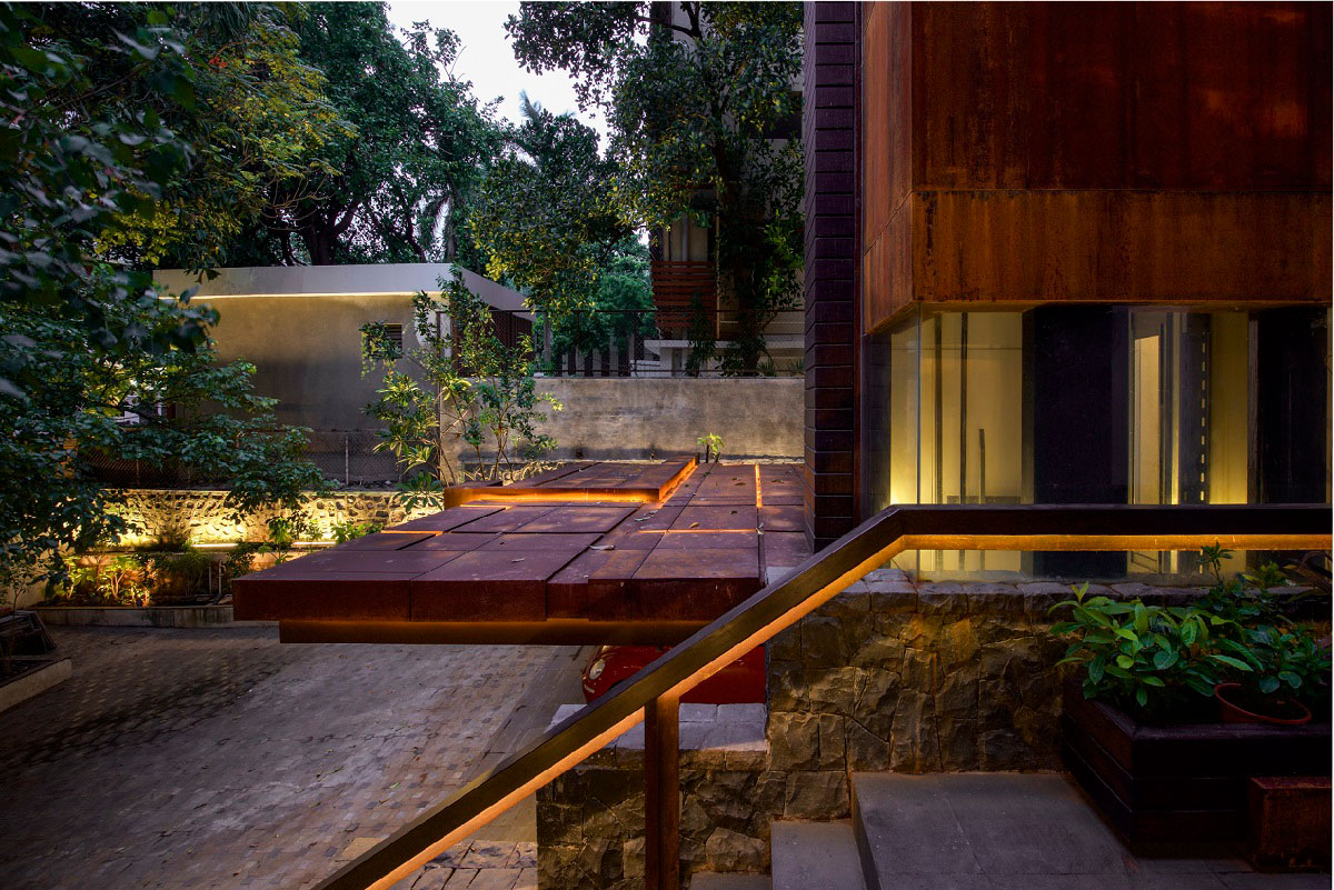
The underbelly too received an extreme attention to detail, where once again existing site alignments played a vital role in geometry, material differentiation, as well as lighting placement – with the axis leading to the home being accentuated through a lowering of the ceiling. The rain water collection plate, is texturally differentiated from the rest of the underbelly of the canopy, by continuing with the materiality of the top onto the lower surface – revealing its alternate purpose.
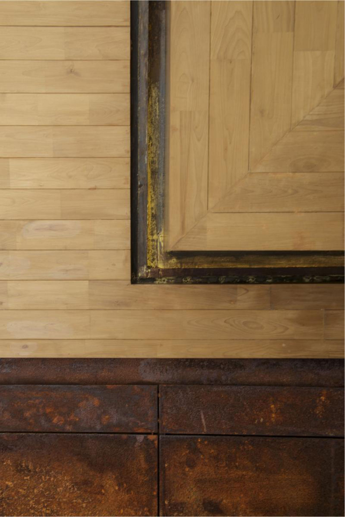
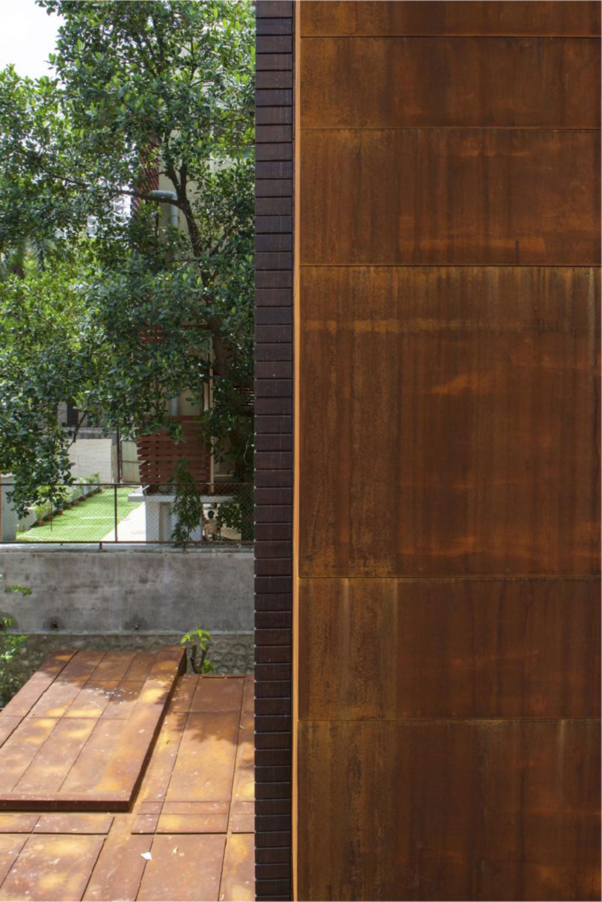
Similar to the canopies the geometry of the elevator core too emerged from adjoining contextual guidelines. The structure, joint lines, and ofcourse the grooves, all find form and purpose though context of the existing facade. The materials and textures chosen for the project are a continuation of the existing paletteprevailing within the home – white plastered surfaces, treated random rubble basalt stone walls, ipe wood and glass. Our intervention in addition to incorporating these materials to signify a seamless transition into the old, utilized the rustic yet poetic materiality of weathering steel –a material that eliminates the need for painting, and forms a stable rust like appearance once exposed to the weather. Hence the name, THE ORANGE EXTENSION.
Images