Excerpt: 3fconcept’s LAPH café interior design project involved renovating two stories of a tube home into a coffee shop, with the goal of designing an interesting landmark to create attention and increase the emotions of passersby. For the interiors, cement colours were used for ceilings, walls, and floors, as if the covered materials of the house had just been removed. The selected stone was also grey. All these elements create a rustic contrast with the white front sign.
Project Description
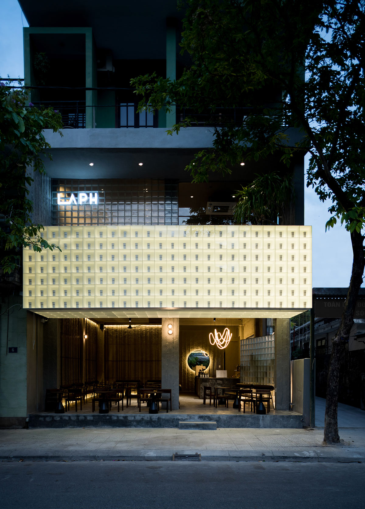
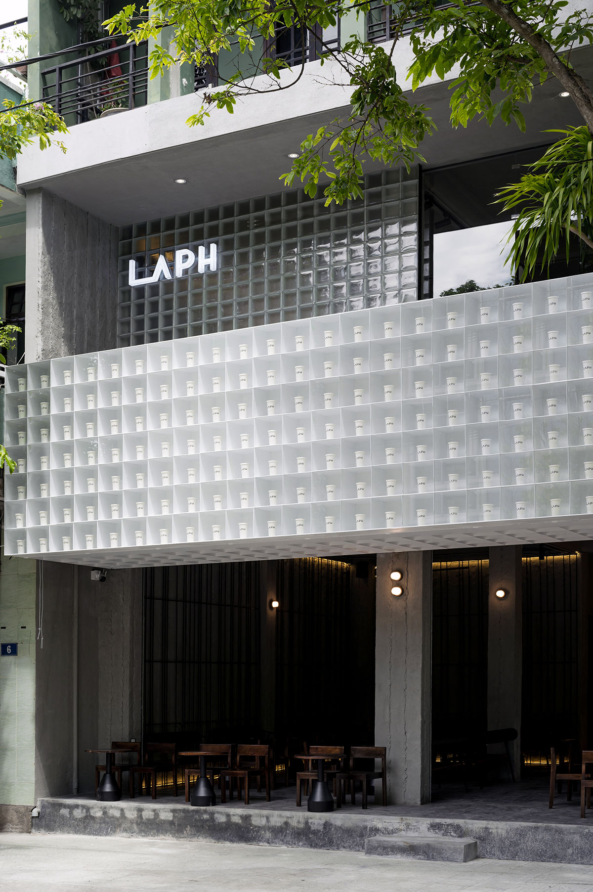
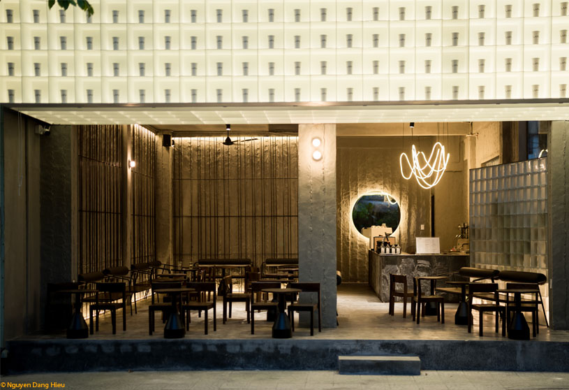
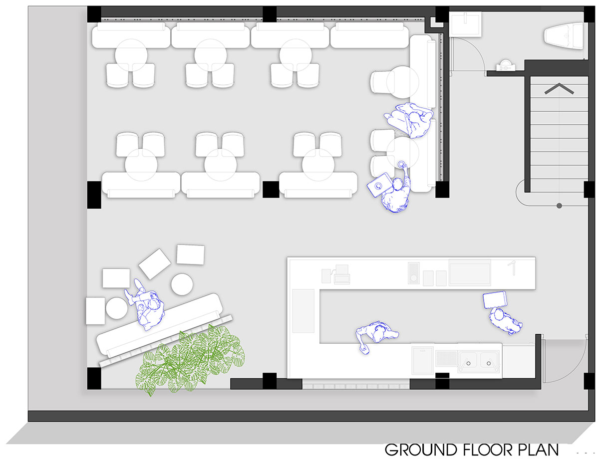
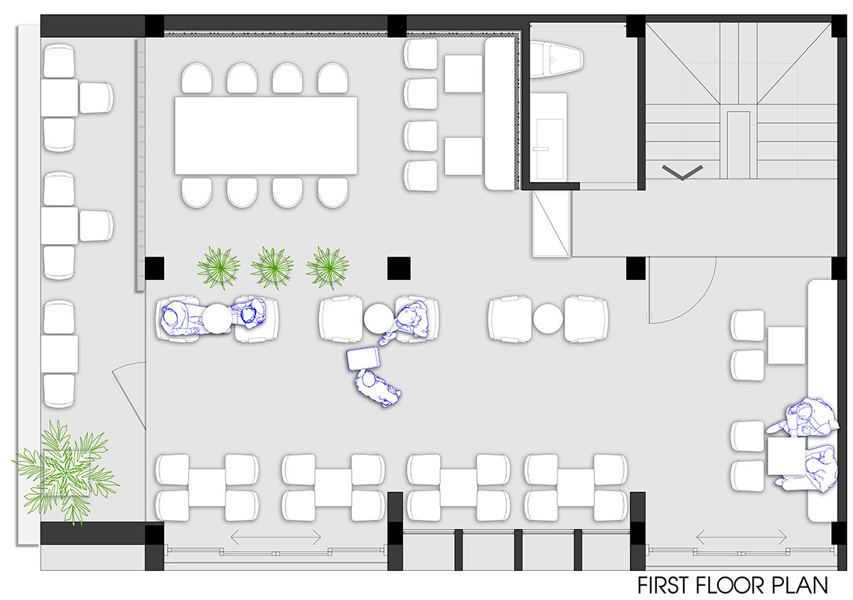
[Text as submitted by architect] LAPH Cafe is a coffee shop renovated from two floors of a tube house in Hue city. With the facade not being too wide and the requirement to retain the entire structure of the house as the current owner still lives there, the designers were given too little “land” to create space. As the width of this house was not too large and it was located on a rather narrow and deserted street, the idea was to design an interesting landmark to create attention and increase the emotions of passersby.
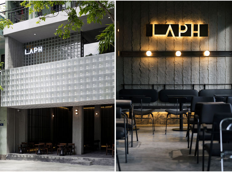
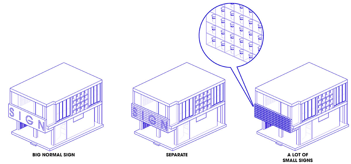
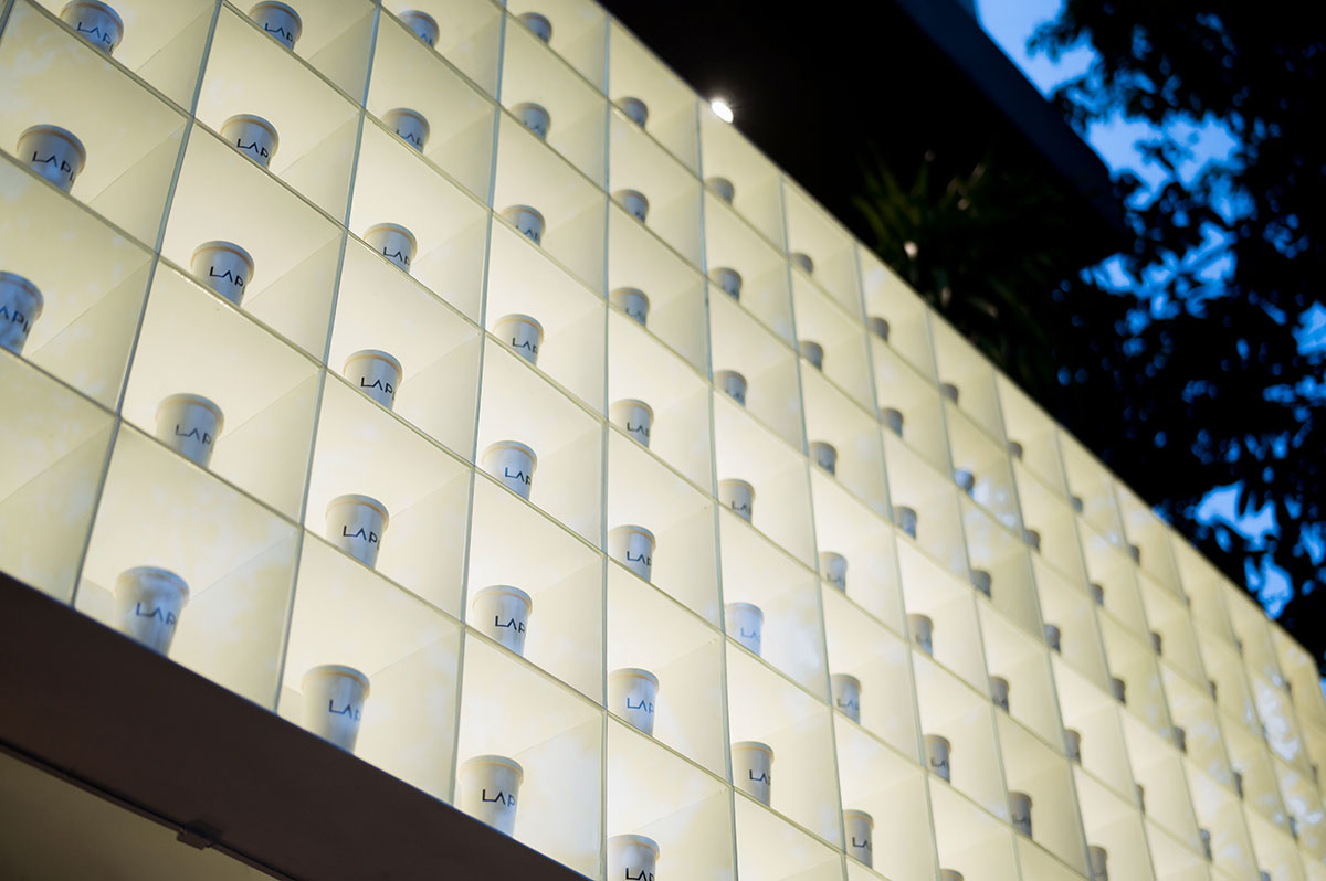
In Vietnam, a shophouse is a familiar definition; most of the houses are bordered on major roads that are used for business or lease business. However, land in the centre is often very expensive, so these are mostly tube houses with narrow facades. To increase the effectiveness of advertising, business owners must expand the sign to the maximum; a billboard across the width of the house with a very large font size is common.
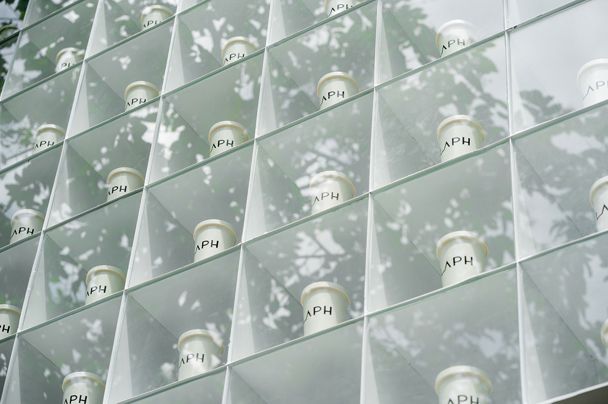
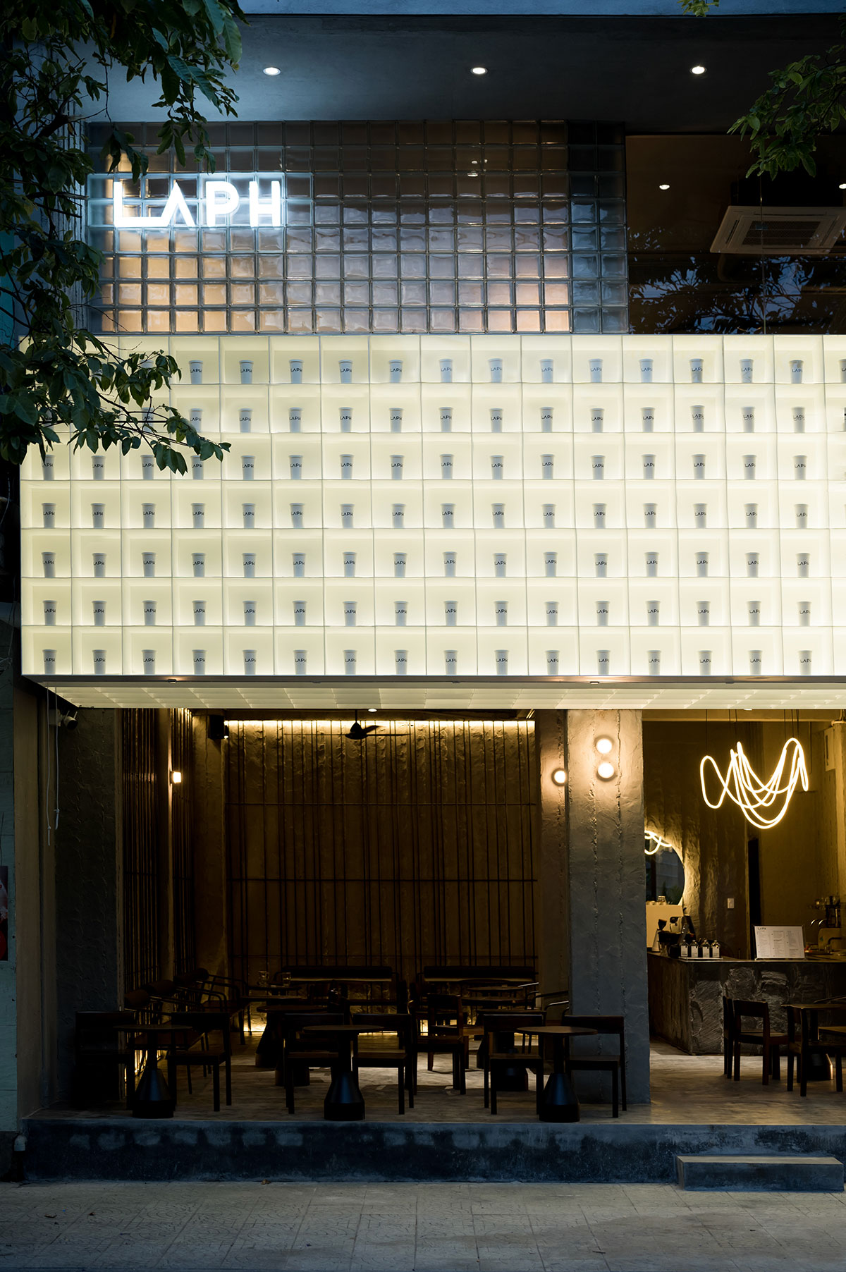
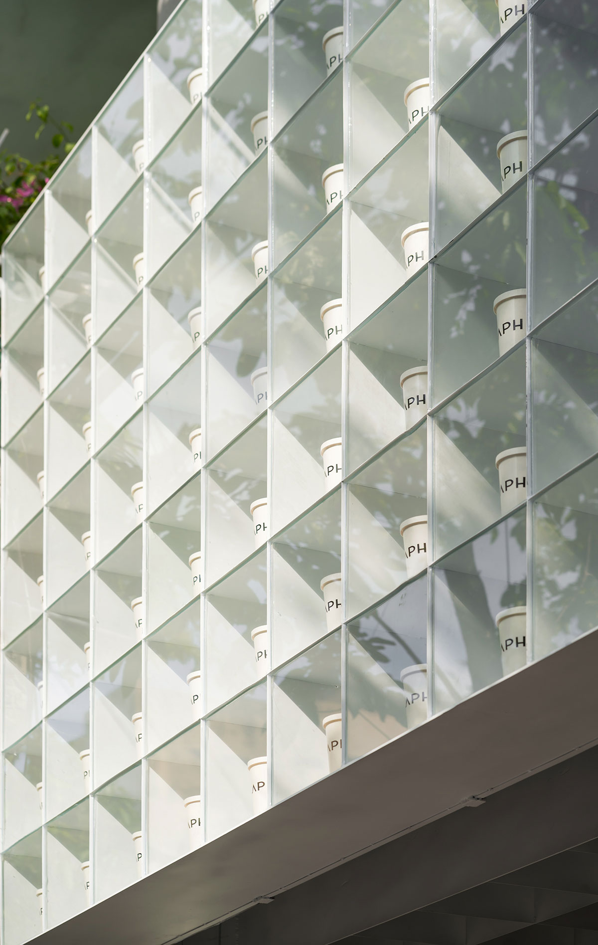
Here, the designers used this method; however, instead of leaving one large sign, it was divided into 168 small compartments, each containing one cup of coffee with the name of the shop printed on it. This subdivision helps keep the sign from being unpolished and boring while still attracting attention. Behind each compartment, a small gap is left to balance the humidity inside and outside to avoid dew condensation, then sealed with metal mesh to prevent insects.
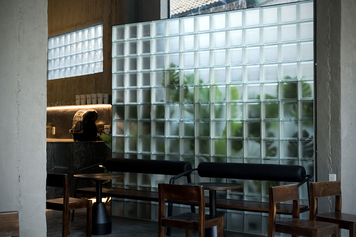
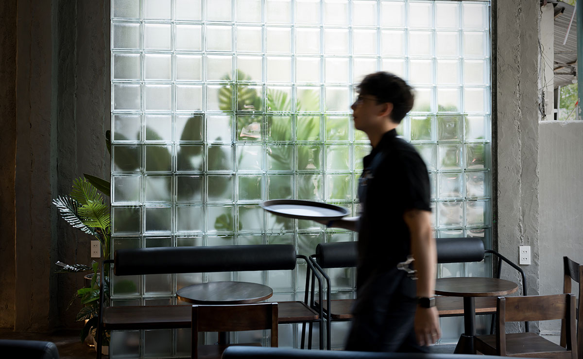
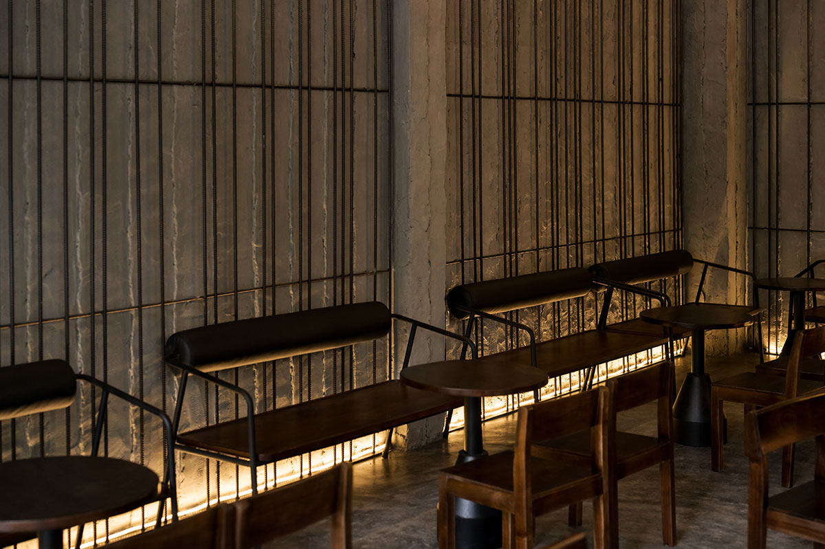
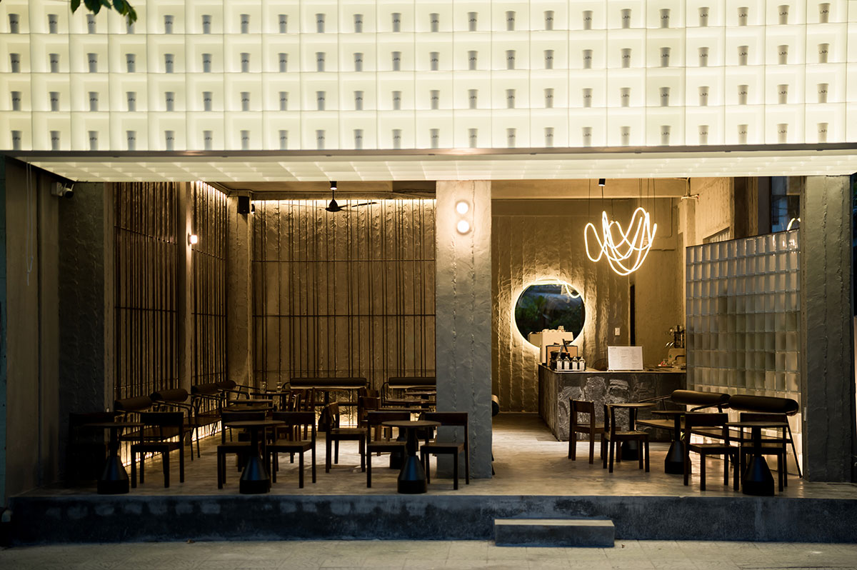
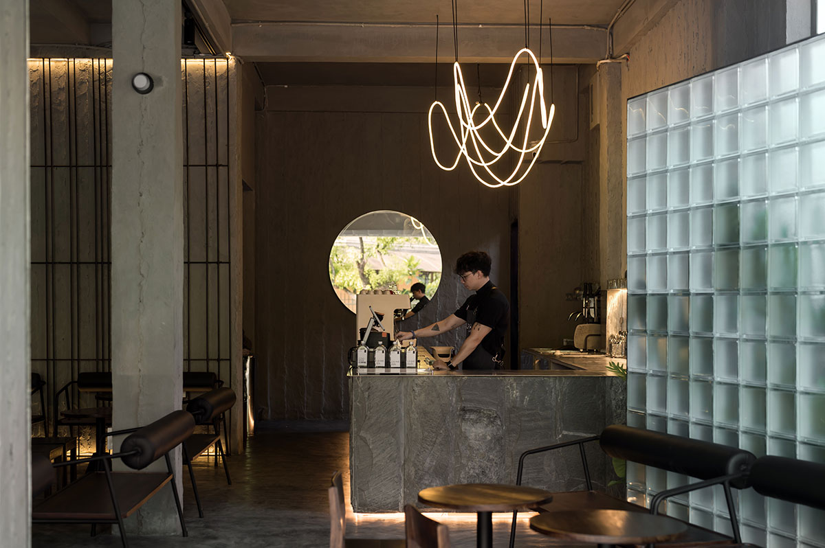
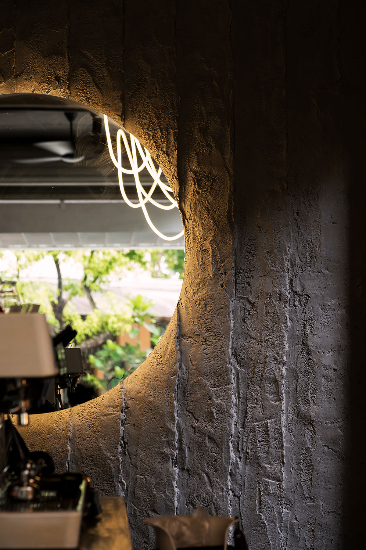
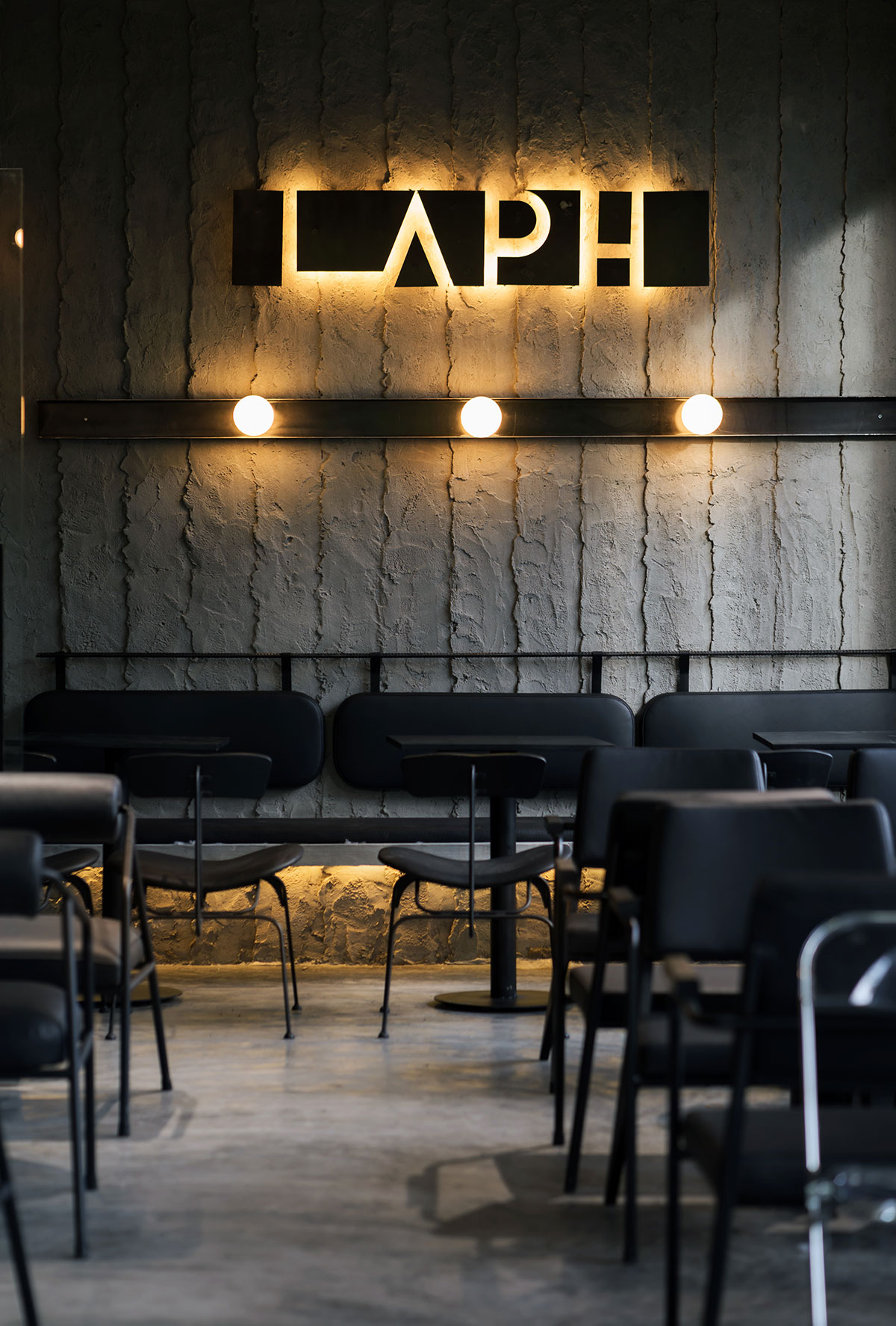
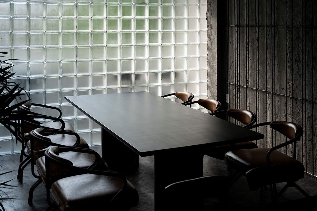
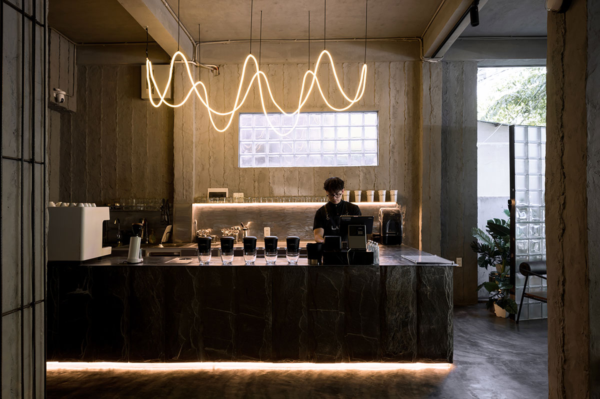
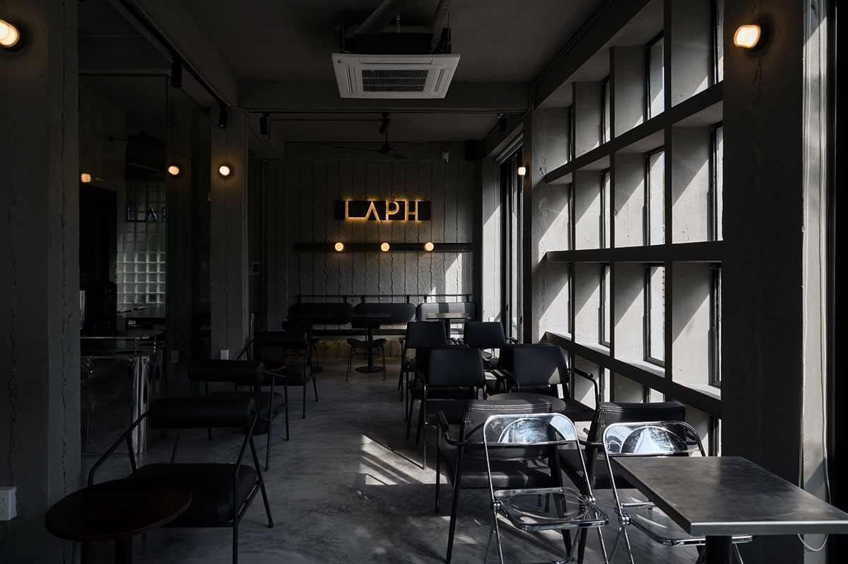
For the interior, the goal was to create the feeling that it was exactly a house renovated as a coffee shop. Ceilings, walls, and floors use cement colours as if the covered materials of the house were just removed. The selected stone was also grey. All these elements create a rustic contrast with the white front sign. Yellow lights and green plants were used to balance a limited palette and purposely lower saturation to increase the warmth and vitality of the interior.
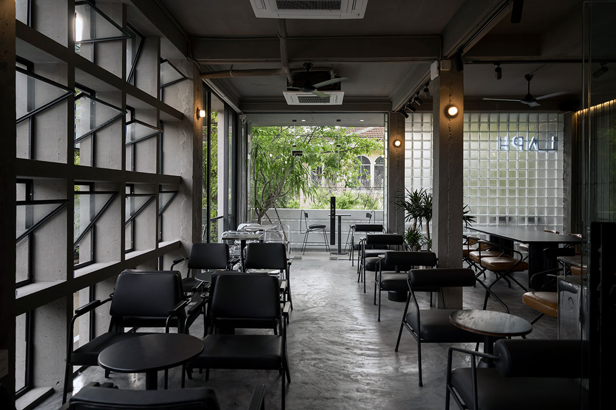
From the overall framework to the detailed expression, the aim was to achieve a balance between creativity and functionality, between simplicity and user emotions. All just to create a relaxing and enjoyable space for the visitors to start a new day.
Images