Excerpt: ‘TU Crystal Plaza Shanghai’ by Tens Atelier is an interior design project that uses minimalist design to convey a sense of soft lines to people. Using the concept of fabric, the structure features curved walls that create a fluid space with blurred boundaries. This dynamic, open, and introspective design resembles a folded fabric, creating a vivid and interactive atmosphere for customers.
Project Description

[Text as submitted by architect] This is the fourth store image created by Tens Atelier for TU and can be considered as the origin of the collaboration between TU and Tens Atelier. TU has always conveyed the brand’s philosophy of a contemporary feminine image that is not aggressive, not compromised, unrestrained in style, gentle but also powerful.
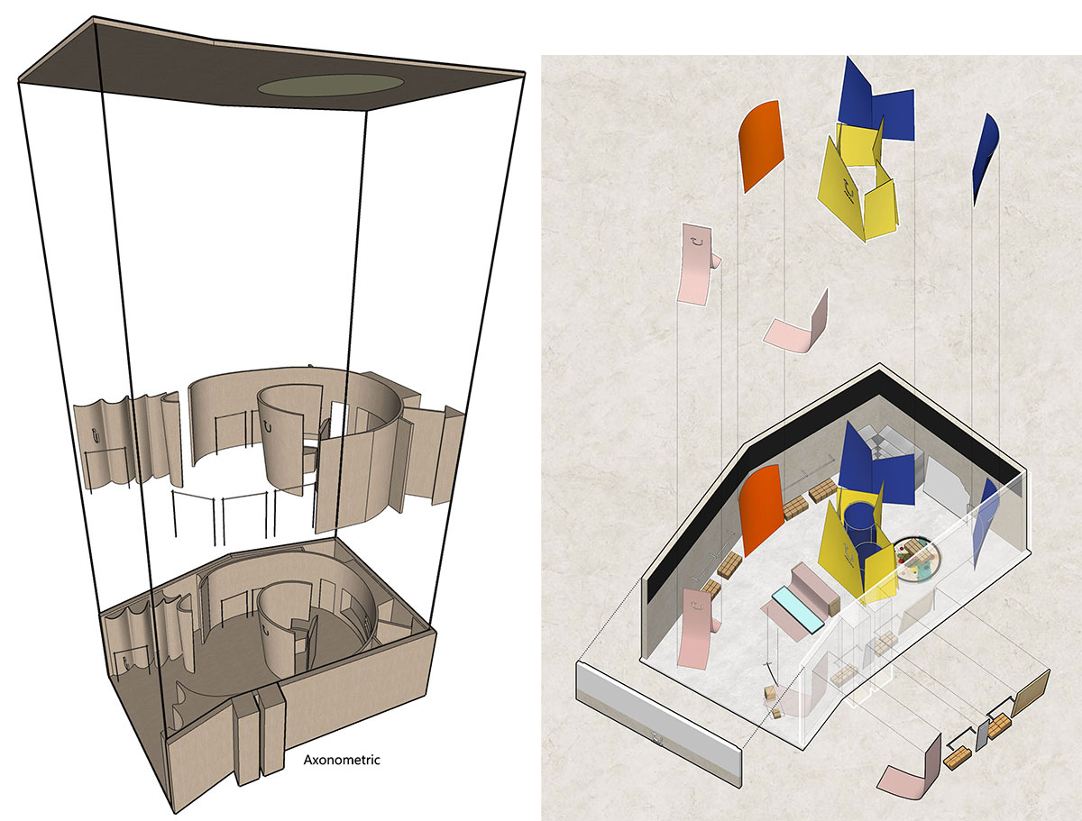
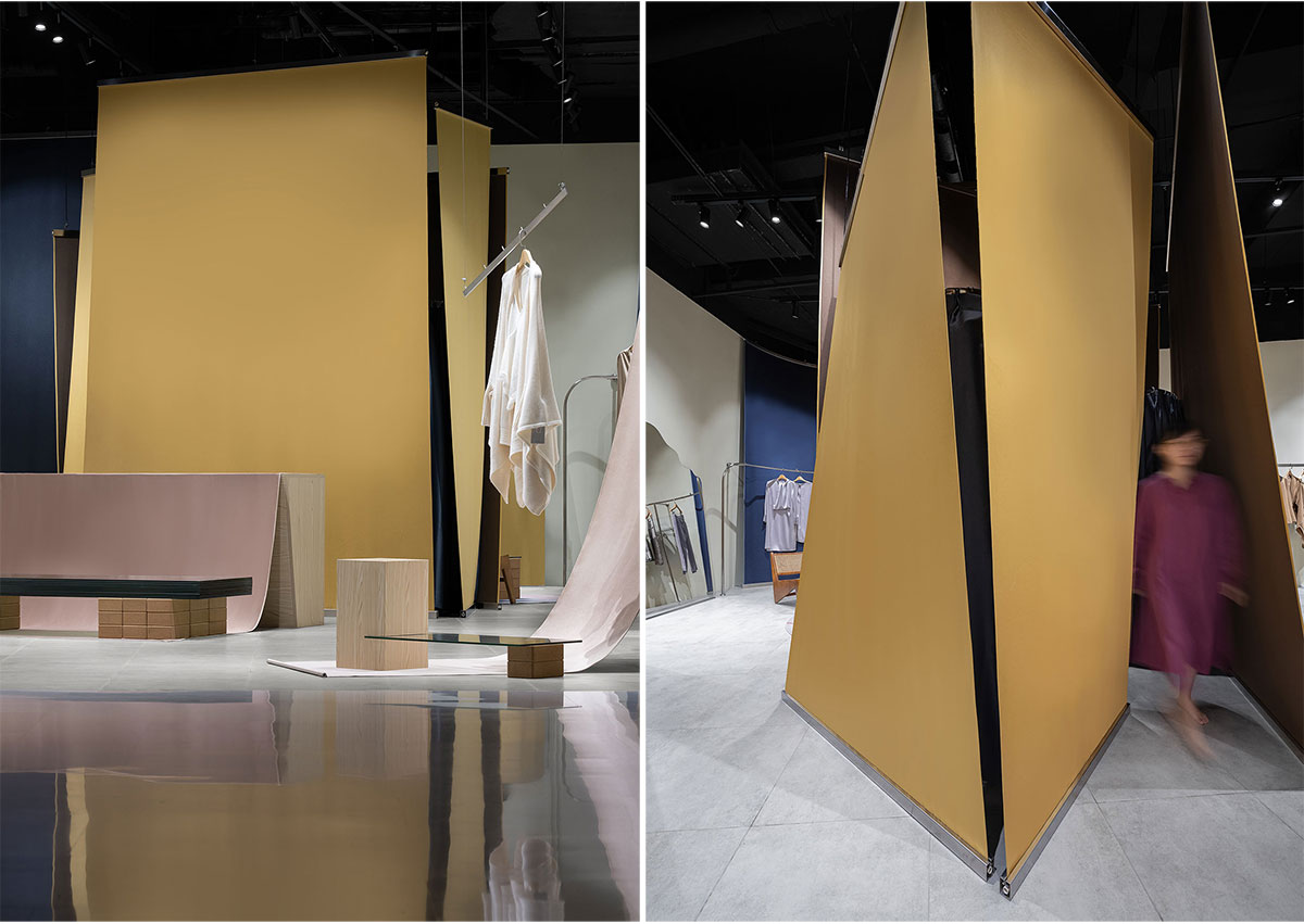
Last year during Shanghai Fashion Week TU was invited to set up a Pop-up store at Crystal Plaza, with a very short project cycle of only 15 days from design to opening. Combined with TU’s new season concept “Kandinsky – Impromptu Geometry”, the open space and the tension of the fabrics were used to divide the space, attracting the attention of customers. The Pop-up store became a popular shop in the mall, and the brand decided to open an official shop there, which led to the fourth image of the “Golden Salon”.

Unlike the pop-up store and the 1000 Trees store, the client wanted the overall style of this store to continue TU’s simple and gentle brand concept, using minimalist design to convey a sense of soft lines to people. In order to echo the brand concept, the space was used to highlight the products, and to reflect the beauty of the brand itself with a restrained design approach.
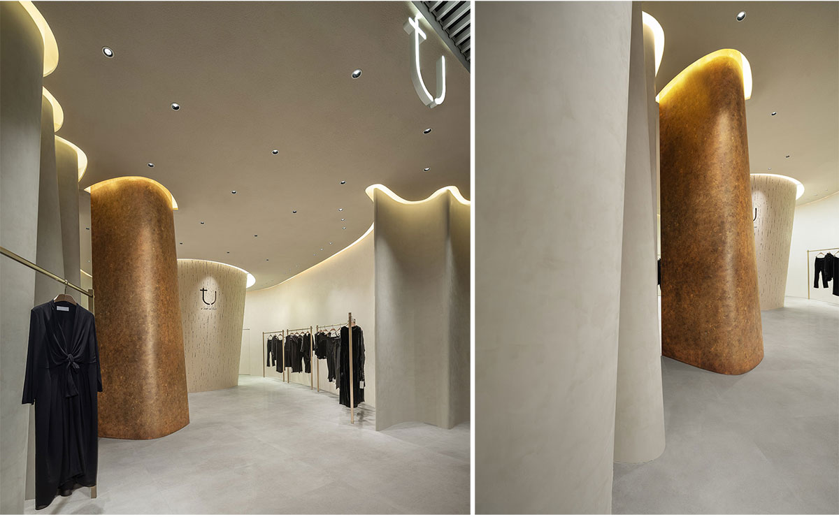

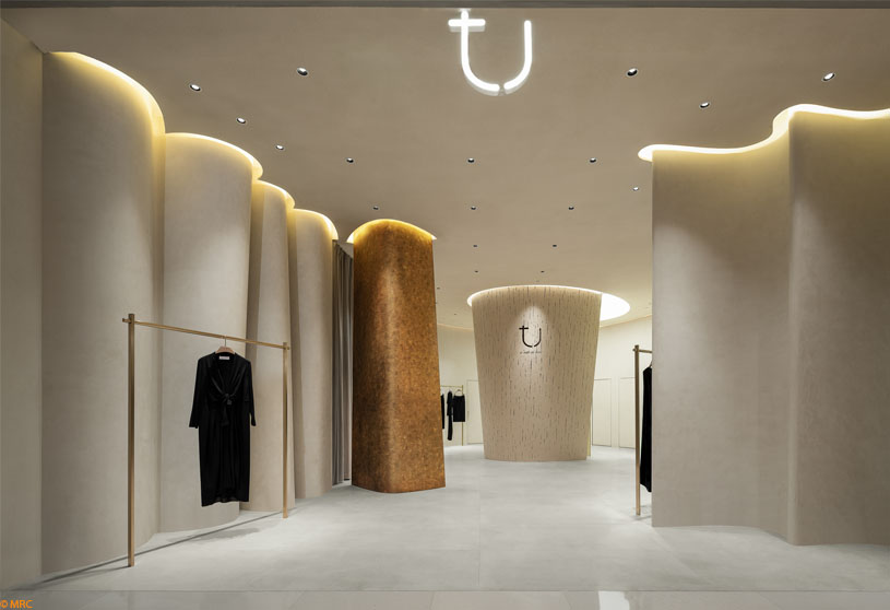
The designers have continued to use the concept of fabric, the main structure is made up of a number of curved walls, and the final shape of the wall is completed with a number of curvature adjustments in order to create some variation on the single curved surface. The boundaries of the space are blurred and interpenetrated, creating a ‘fluid space’, where fluidity is fused into the space in a vivid and dynamic way. Like a folded fabric wrapping the customer in a gentle space, it creates an image of the space that is both open and introspective.
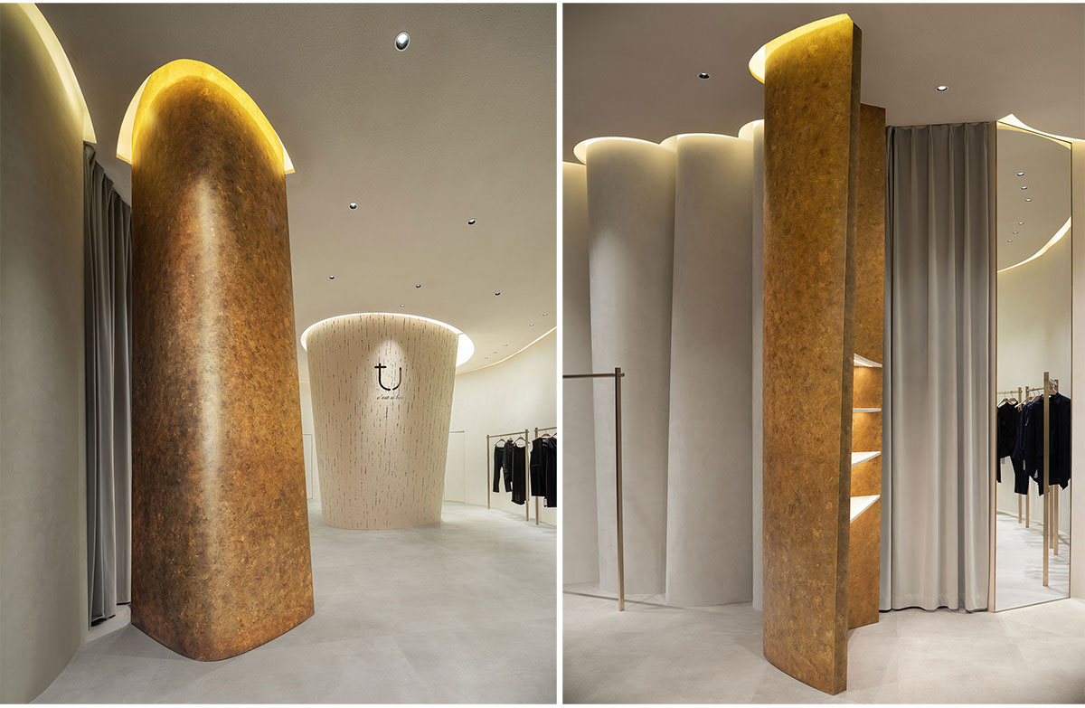
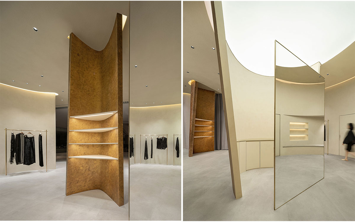
The effect of light and shadow projected on the walls along the wave form gives the minimalist space a sense of rhythm and hierarchy. Warm earth tones are used to reflect the natural and unadorned of the space.


The entrance is converging, with customers looking into the shop from the public area, gleamingly. With the fluent, dynamic, guided lines, creating a flowing and coherent spatial effect. The infinite and coherent curved surfaces, like a soft veil, enrich the space and add to the experience of the space, giving rise to an infinite imagination and leading the customer to discover and explore.
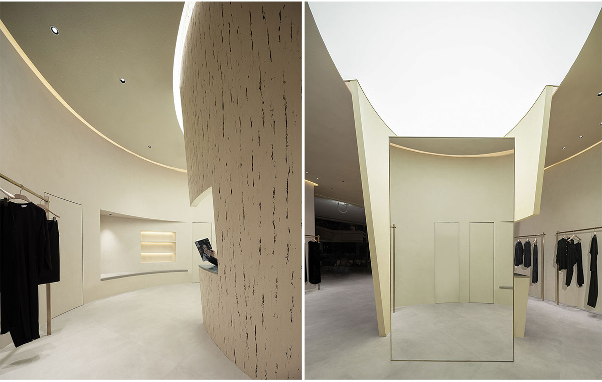
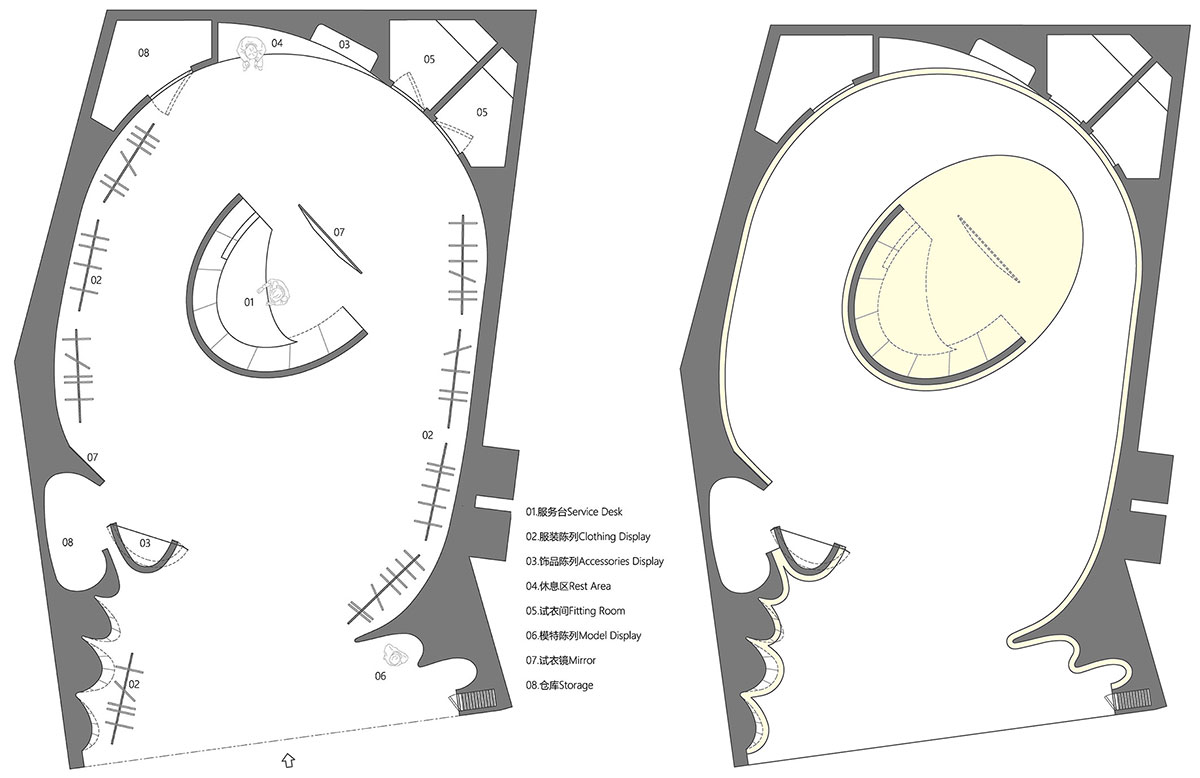
In the open plan layout, a funnel-shaped block has been placed in the space to define the functions of the space. The top of the funnel mimics a skylight, which softly floods the room with light, while the inside of the funnel houses the cashier’s area, with the fitting room and storage space blocked off by the funnel space.
Images


